Design Paper 001
The Barry Roberts Identity System
A restrained visual system for a Chief Executive and Creative Director working across British brands, design, production and cultural projects.
Introduction
Every project eventually reaches the point where it needs a clear way of presenting itself.
For me, the challenge was slightly different. Rather than creating the identity for a single company, product or publication, I needed an identity capable of supporting work across jewellery, silver, restoration, British brand development, cultural media and a growing portfolio of independent projects.
The solution was not to create something louder. It was to create something quieter.
This paper explains the thinking behind that decision.
The Brief
Develop an identity for Barry Roberts that could act as the public face of my work without becoming the focus of it.
The website needed to sit comfortably alongside brands such as Roberts & Co., Sampson Mordan & Co., Roberts London and The Company of Extraordinary Companies, while remaining clearly independent from each of them.
It also needed to feel appropriate whether discussing typography, a restoration project, a piece of jewellery, a website, a film, a design experiment or a walk through London.
The Problem
Many founder websites follow one of a few familiar paths.
Some present themselves as personal brands, built around the individual.
Others resemble agency portfolios, showcasing selected projects through polished case studies.
Others become lifestyle journals, mixing work with personal updates.
None of those approaches felt quite right.
The work spans several disciplines, but the connecting thread is not a profession. It is a way of working: observing carefully, designing thoughtfully and building patiently over time.
The identity needed to reflect that.
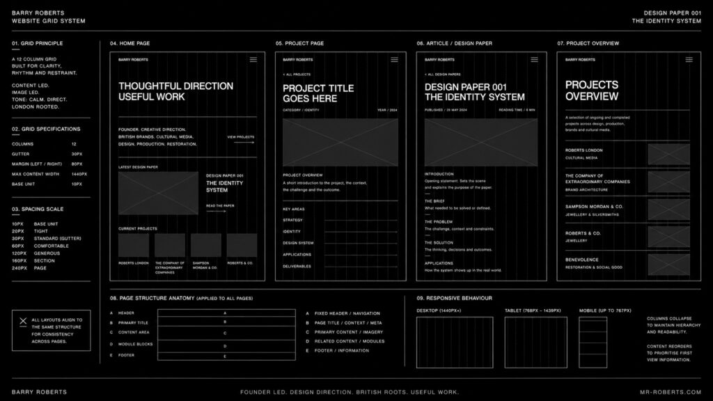
The Constraint
The identity had to support a growing portfolio rather than compete with it.
It needed to remain visually neutral enough that each project could retain its own character.
It also had to work consistently across a website, journal articles, social media, presentations, printed material and video without requiring constant redesign.
Simplicity was not an aesthetic preference. It was a practical requirement.
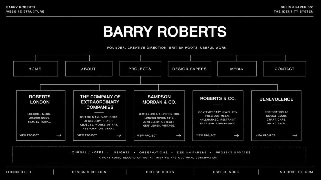
The Design Tension
Several opposing ideas had to be held in balance.
Personal, but not personality-driven.
Editorial, but not a magazine.
Professional, but not corporate.
Refined, but not luxurious for its own sake.
British, but not nostalgic.
Minimal, but never empty.
The identity is an attempt to resolve those tensions through consistency rather than decoration.
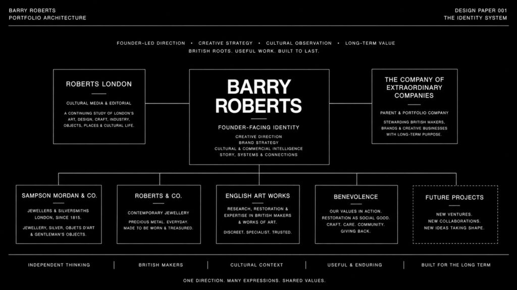
The Principle
Restraint creates clarity.
Every visual decision should make the work easier to understand rather than draw attention to itself.
The role of the identity is to organise information, establish hierarchy and create continuity across different projects.
If the reader notices the work before they notice the design system, it is doing its job.
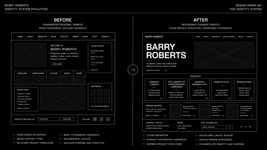
The Visual Direction
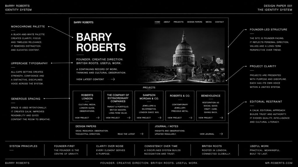
The visual language is deliberately reduced.
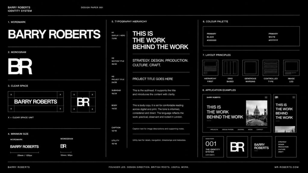
A monochrome palette provides consistency across every medium.
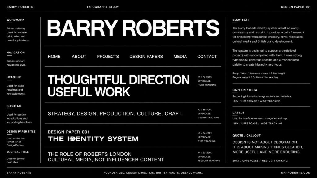
Bold uppercase typography establishes confidence without relying on ornament.
Generous spacing allows individual projects to breathe.
Photography is treated editorially, favouring observation over spectacle.
Layouts are based on clear hierarchy and disciplined alignment rather than visual effects.
Nothing is included simply because it looks fashionable.
The System
The identity is not a logo. It is a repeatable framework.
The same principles extend across:
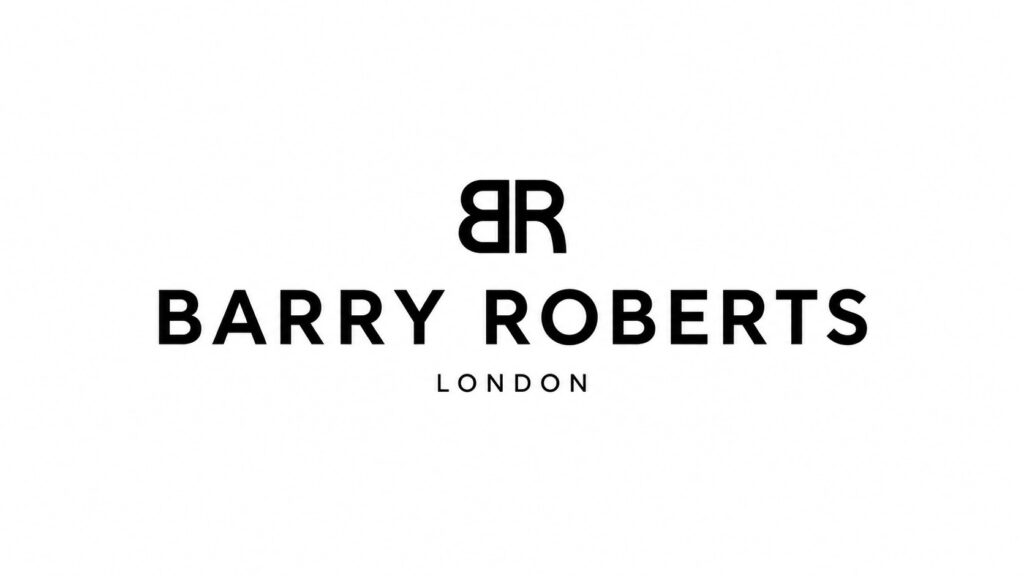
- the Barry Roberts wordmark
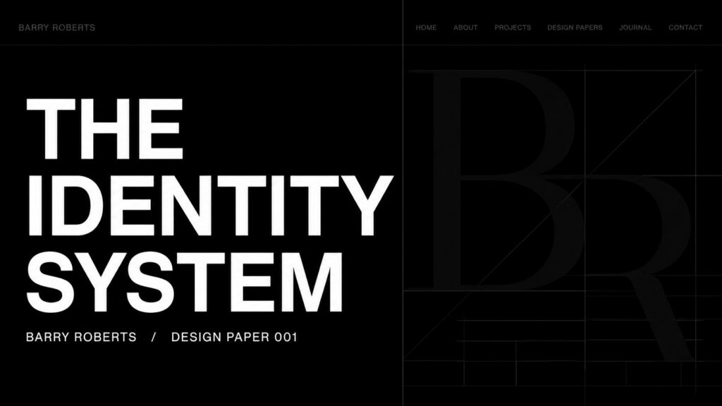
- the monogram
- website navigation
- page titles
- Design Papers
- project pages
- presentations
- social media graphics
- YouTube titles and thumbnails
- printed material
By keeping the rules consistent, very different subjects can sit comfortably beside one another without appearing unrelated.
Applications
The system supports work across several distinct areas.
It provides a consistent framework for documenting the development of British brands.
It explains design decisions through Design Papers.
It connects editorial projects such as Roberts London with commercial projects without confusing their different purposes.
It allows future work to be added without redesigning the entire identity each time.
The system is intended to grow through use rather than through continual reinvention.
The Result
The Barry Roberts identity is intentionally understated.
It does not attempt to become a brand in its own right.
Instead, it provides a stable framework for documenting work in progress, recording design decisions and connecting projects that might otherwise appear unrelated.
The ambition is not to create a recognisable visual signature for its own sake.
The ambition is to create a coherent record of thoughtful work over time.
Working Note
This identity is unlikely to remain unchanged forever.
Like the projects it supports, it will continue to evolve through making, testing and refining.
That feels appropriate.
The purpose of these Design Papers is not to present finished answers, but to document the decisions behind them.
In that sense, this is less a conclusion than the beginning of a working record.